Posted in:
Map of Linkedin Connections
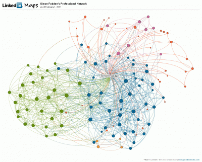
Linkedin Labs lets you map your various connections on that service. You can see mine in the image below, as an example of what you’ll get.
The map on the Linkedin site is dynamic, in that clicking on or hovering over various points reveal the people behind the dots and their links to the people in your circles. The program attempts to group your connections, and you can then label these groups however you please. The brief video below explains:


Comments are closed.