Gapminder and More
This is a post of a few parts, and one that is probably so far off topic for Slaw that I wouldn’t have written it if the material it’s about weren’t so incredibly interesting — and important. I don’t gush often — at least, I think I don’t. But I’m gushing about this content.
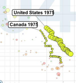
1. I subscribe to the TED Blog feed and, so, received an entry about a presentation by Hans Rosling. It’s a 20 minute talk on the development of nations along a number of axes, which makes it sound truly dull. It is, in fact, one of the least dull presentations I have ever observed. I was riveted by the content, by Rosling’s dry wit and passion, and by the splendid tool — the Gapminder — he used to demonstrate his “rolling stats.” The fact that this Swedish public health doctor, who has spent 20 years working in Africa, who developed the software that he uses to astonish us, and who presents a refreshingly different view of how the course of Africa and the “developing nations” can be understood… the fact that he swallows a sword as his finale, blew me away.
Take the time to watch his talk. You might well look at things differently afterwards.
 2. This led me to Gapminder. It turns out that Google has just acquired it, and so it now lives under tools.google.com/gapminder/. Here you are able to reproduce the rides that Rosling took you on in his lecture. But you can also see how over time this variable changes when run against that variable for all the countries for which there is data or just for those countries in which you’re interested. This is truly fine tool and a stellar example, to my mind, of how to make information graphically clear.
I’ll be watching to see how Google chooses to develop this resource, which is now limited to national development data of various kinds, although “limited” seems a wrong term. Presumably Google will eventually let us apply the same technology to inputs from other fields.
3. The data Rosling is displaying comes from the United Nations Common Database, which, he tells us, has made its data free as of May 1. I cannot begin to describe the wealth of data that this makes available. (As a mere glimpse I have appended the topic list to this post below the “read more” tag where you’ll find 31 topics, many of which have 30 or 40 series within.) You can construct tables from any set of variables you select. And, I presume, those adept enough could port the data straight into their websites or applications. This is a fund that belongs in everyone’s reference list.


Comments are closed.